A “scary chart” has recently made the rounds of numerous financial analysts and news commentators. It exhibits what appears to be a disturbing parallel between the current U.S. stock market and the DJIA in the period (1928-1929) just prior to the 1929 crash. A MarketWatch.com article, for instance, warns that if the U.S. stock market follows the same script, “trouble lies directly ahead.” One version of the chart is the following (source: McClellan Market Report, via Matthew O’Brien):

So what are the facts here? Should investors dump their portfolios immediately?
The problem with this graph, like many of its kind, it that it is misleadingly scaled—the two lines of the graph are not scaled the same. As Matthew O’Brien has shown, when one normalizes the starting points to 100, using the same vertical scaling factor, the “parallel” disappears (source: Matthew O’Brien):

Moreover, almost any bull market period with a significant run-up in major market indices can be superimposed on the 1928-1929 episode, just by suitable linear scaling of the x and y axes, and the casual reader could be convinced that there is a “parallel.”
For example, here is a similarly scary comparison between the same 1929-1930 graph and the U.S. stock market in the 2010 time frame. The author of this column noted numerous features of similarity, included instances of decline and rebound at various percentage levels, “shoulders,” “heads,” and a “rare double-digit right shoulder.” Needless to say, this “parallel” did not extend much beyond 17 Aug 2010, the date of the column where these graphs were shown. Whereas the DJIA declined during June 1930 by 22% (nearly to the November 1929 crash levels), it rose by 22% from Aug 2010 to May 2011. Not a very good prediction!
Joshua Brown’s column provides an even more striking example, comparing the S&P500 index during the 2012-2013 time frame to the Nasdaq composite index leading up to the 2000 crash (source: Joshua Brown):
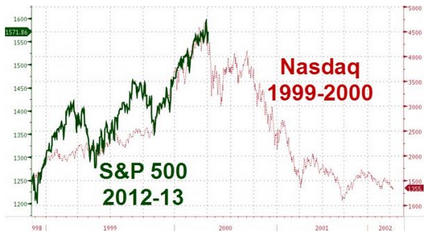
This graph makes it appear that that S&P500 index is about to undergo a precipitous plunge (near the end of 2013), because its run-up seems to roughly coincide with the run-up of the Nasdaq index. But, as noted in Brown’s column, the S&P500 graph has been scaled differently than the Nasdaq graph: whereas the S&P500 increased only from 1250 to 1600 during 2012-2013 (a 28% increase), the Nasdaq index increased from approximately 1600 to over 4750 (a 197%, nearly a factor of three) over the period in question (2 Nov 1998 through 1 Mar 2000).
Numerous analysts have castigated the latest “scary” chart (the one shown at the top of this column). Joshua Brown explains that this type of graph often frightens individual investors into making rash decisions, decisions that may well affect their future financial health. What’s more, he explains, “the more we see this kind of pornography, the more likely it is to have an impact on crowd psychology and become a self-fulfilling prophecy.”
Steven Russolillo, writing in the Wall Street Journal, says that “It’s time, once and for all, to put an end to all the drama surrounding the stock-market chart comparing now to the crash of 1929.” He quotes Jeffrey Saut:
You can ‘scale’ any chart to do just about anything you want it to imply! In this case, the scale makes the comparison to 1929 with the present stock market chart pattern appear eerie. However, if you index that same chart so that you are comparing apples to apples, the correlation to 1929 disappears. Moreover, I have been around long enough to have seen this ‘act’ before. The time period was the 1980s–1990s when ‘they’ were trying to scale Japan’s Nikkei Index to that of the Dow Jones Industrial Average. All these kinds of chart shenanigans prove is that, ‘Where you stand is a function of where you sit, or that you can make numbers do anything!’